

Mid-century style in furniture is characterized by its clean lines, simplicity, and functionality. It emerged in the mid-20th century, roughly from the 1930s to the 1960s, and remains popular today due to its timeless appeal. It avoids excessive ornamentation, favoring a minimalist approach that emphasizes form and function: this is exactly what the EKENÄSET armchair from Ikea summarizes.
Mid-century furniture often embraces bold colors, including shades like mustard yellow, avocado green, and burnt orange. These hues add a pop of vibrancy to the otherwise minimalist designs. For the EKENÄSET armchairs, Ikea opted for gray-turquoise and light-beige versions in their original Kilanda fabric.
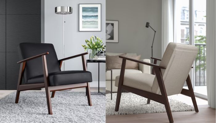
Bring home a mid-century furniture approach with the IKEA EKENÄSET armchair
The EKENÄSET armchair helps you create an open and airy feel in a room. Its design contributes to the sense of space and lightness, as well as a timeless look that will withstand time. As many other Ikea pieces, this furniture piece will never look old, or out-fashioned.

According to Ikea customers, that armchair has earned a solid 4.7-star out of 5 rating, with its appearance and design being the most highly rated aspects. “Very comfortable, a simple and elegant design. Easy to assemble and works in several decor themes,” a verified shopper stated.
“This chair is easy to put together, is comfortable, and looks great. The cushions are thick, firm, and supportive, but not hard or uncomfortable. I’m really glad I bought 2 of them,” said Jeff, another happy shopper.
Are you up for leather? There is an IKEA EKENÄSET version for you
The EKENÄSET armchair, crafted with Ikea’s signature Jonsbyn leather, is the version that perhaps best fits your home decor. Leather always exudes elegance, distinction, and classiness, in addition to being resistant to the past of time.
The design is the same, with those simple but bold lines of the mid-century era. All versions come in wood of a dark color, with a barely slightly glossy layer of matte lacquer. What a beautiful design, please friends, give me a break!
The light beige version is priced at $249, while the gray-turquoise one has a price tag of $279. On the other hand, the black leather Jonsbyn is worth a little more, but it is to be expected because leather is a more expensive material to produce than fabric: on the Ikea website it is marked at $299.
Ikea’s section of armchairs is gigantic. Take a look at their stock here, and pick the one that fits the most your own style.
The psychology of color in interior design
Color schemes play a crucial role in interior design, influencing the psyche of the inhabitants of a space.
Each person reacts differently to colors, so it’s important to understand the preferences and personality of the client when choosing color schemes.
Colors can evoke different emotions and perceptions. For example, black can be seen as depressing or representing order and functionality, while red can be seen as threatening or inspiring.
Green and blue colors have longer wavelengths and are generally associated with calmness and serenity, while yellow, red, and orange colors with shorter wavelengths are stimulating.
Cultural differences, geographic location, and age can also influence how people perceive colors.
Warm colors such as red, yellow, and orange are associated with energy, warmth, and happiness, while cool colors such as blue, green, and purple are associated with calmness, relaxation, and serenity.
The intensity and saturation of a color can affect emotional response. Bright, vivid colors can be stimulating and energizing, while muted or pastel colors can be calming and soothing.
The purpose of the space should be considered when choosing colors. For example, a beauty clinic may benefit from cool, calming colors like blue or green, while a restaurant may benefit from warm, energetic colors like red or orange.
It’s important to consider the target audience, their age, lifestyle, and the desired mood or atmosphere when selecting colors for interior design.